Claude Design: Everything You Can Build in 16 Minutes (5 Real Use Cases)

Visual Siblings
Screens that share similar strategies
Attention Analysis
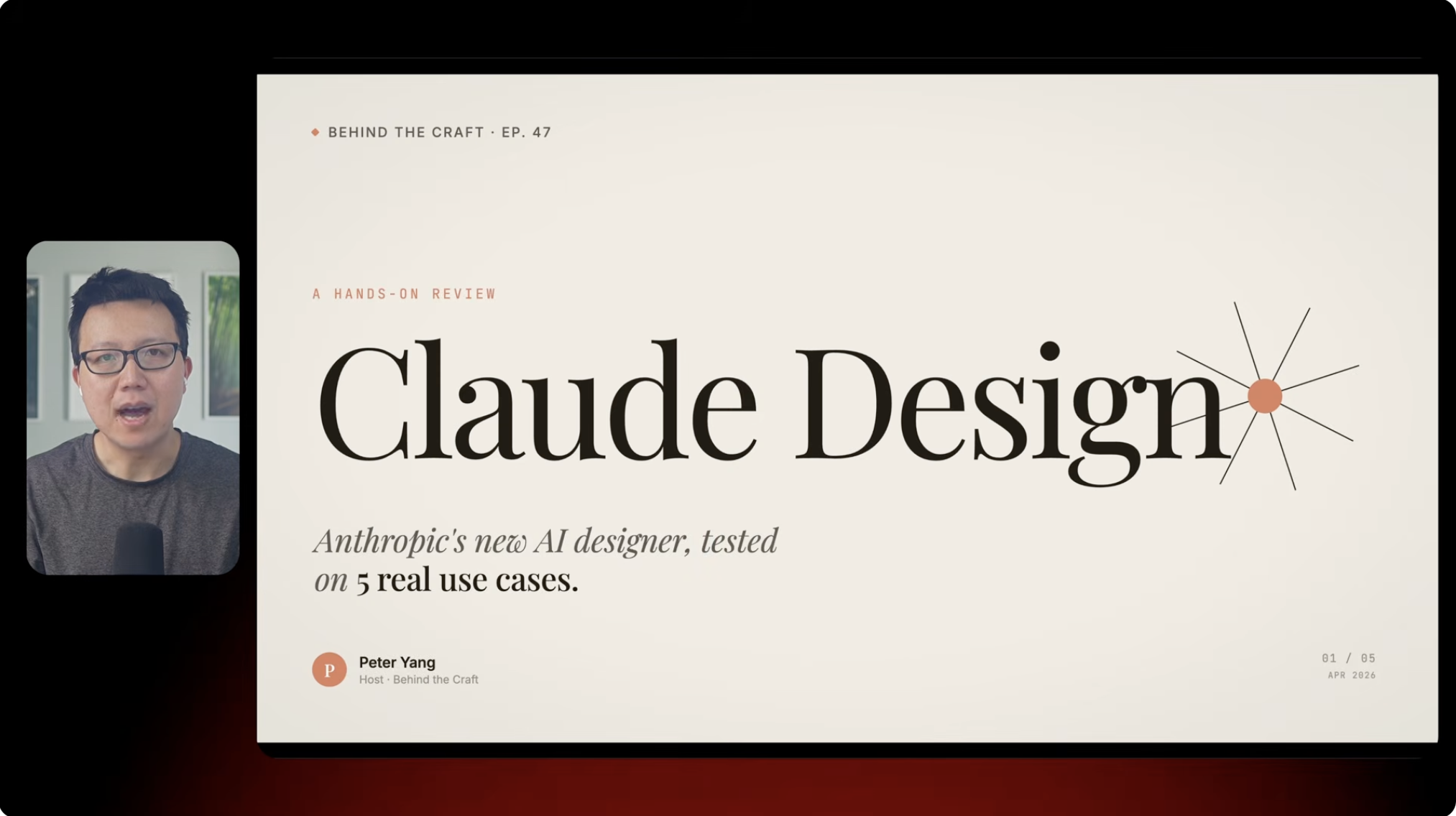
The design relies on premium editorial typography rather than traditional YouTube thumbnail tactics.
Large negative space creates a luxury publication feeling.
The host is present but intentionally secondary to establish authority without distracting from the topic.
The serif typography positions the topic as thoughtful analysis instead of a quick tutorial.
The slide format signals depth and structured learning.
Category:Video Layouts
Color Palette
cream
black
charcoal
muted orange
Brightness: bright slide
Contrast: high contrast
Colors: 4
Visual Siblings
Screens that share similar strategies