How OpenClaw's Creator Uses AI to Run His Life in 40 Minutes | Peter Steinberger

Visual Siblings
Screens that share similar strategies
Attention Analysis
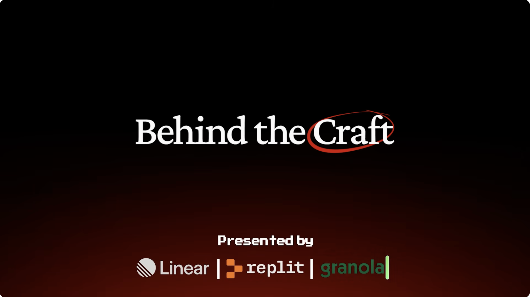
This frame is optimized for brand building rather than click-through.
The large amount of negative space creates a premium documentary feeling.
The red hand-drawn circle adds human imperfection against an otherwise polished layout.
The sponsor selection reinforces the audience: builders, designers, and AI-native creators.
The contrast between serif title and monospace sponsor typography connects craft with engineering.
Category:Channel Branding
Color Palette
black
deep red
white
Brightness: very dark background
Contrast: high contrast
Colors: 3
Visual Siblings
Screens that share similar strategies