Why the SpaceX IPO Is Unlike Any Other

Visual Siblings
Screens that share similar strategies
Attention Analysis
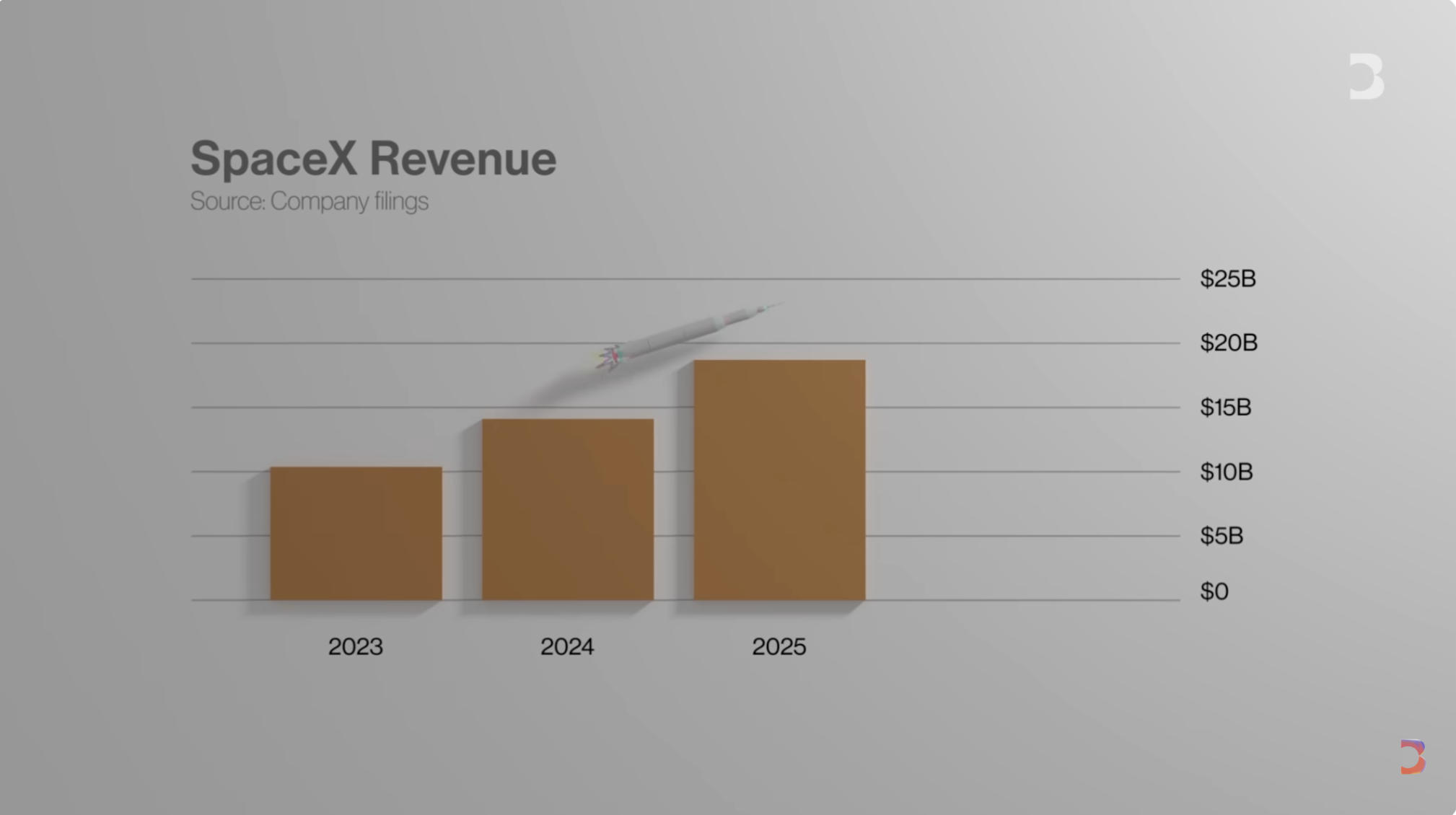
The slide uses investor-deck visual language rather than traditional YouTube thumbnail design.
The faint rocket imagery connects the data to the company without distracting from the chart.
Large negative space creates a premium analytical feeling.
Muted colors make the information feel institutional and trustworthy.
The simple upward trend allows viewers to understand the point in seconds.
Category:Graphics Slides
Color Palette
light gray
brown
black
white
Brightness: high brightness
Contrast: medium contrast
Colors: 4
Visual Siblings
Screens that share similar strategies