I Spent 3 Months Being Curious Instead Of Scrolling (Here's What Changed) // EXPERIMENT COMPILATION

Visual Siblings
Screens that share similar strategies
Attention Analysis
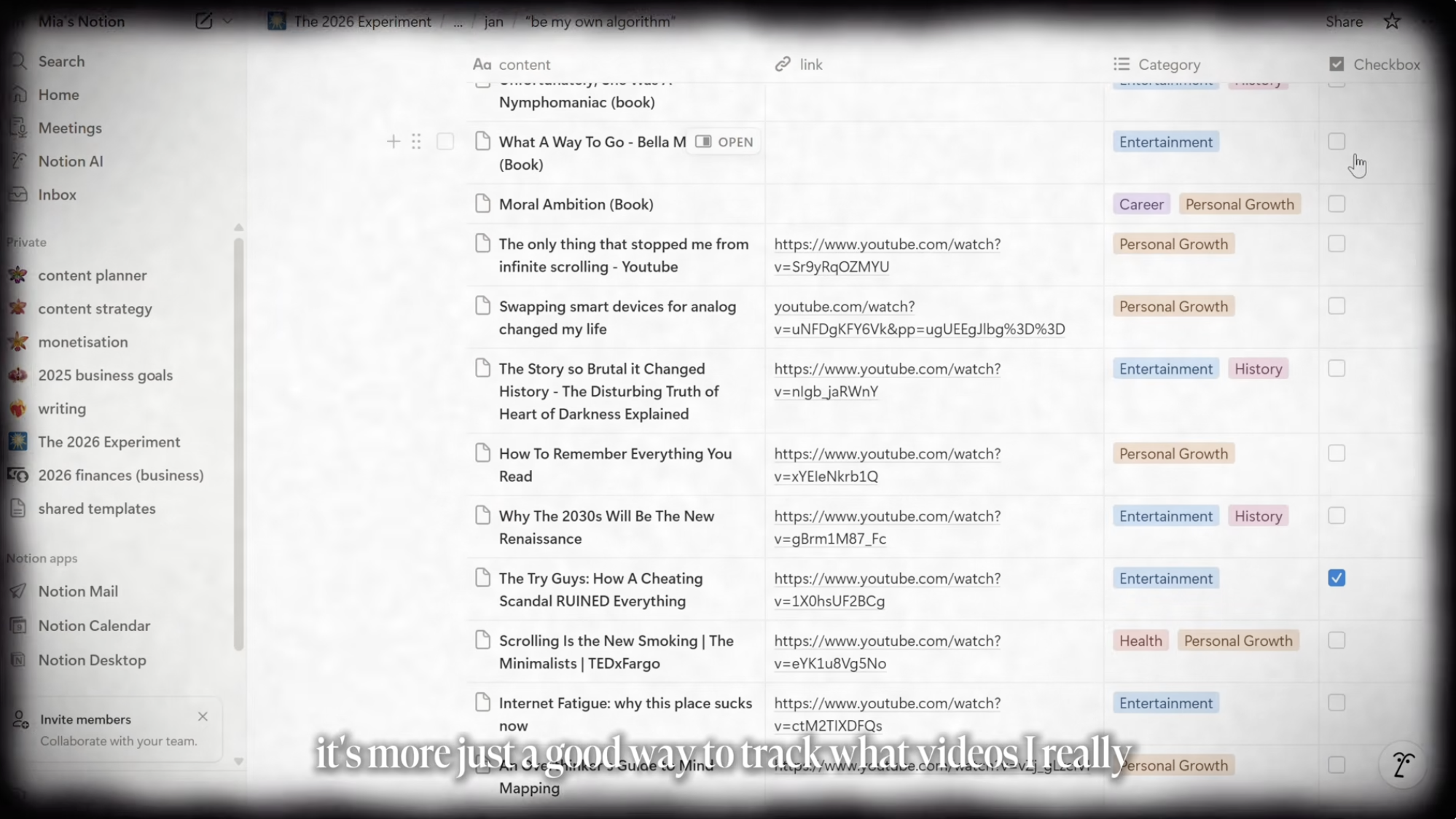
The screenshot-style composition creates authenticity and transparency into the creator's actual workflow.
Soft vignette edges make the otherwise utilitarian UI feel cinematic and emotionally curated.
Pastel category tags help visually organize the database while adding warmth to the interface.
The subtitle overlay reinforces the narrative tone of reflective digital organization.
The overall aesthetic positions productivity as intentional and mindful rather than hyper-optimized.
Category:Video Layouts
Color Palette
off white
light gray
soft black
pastel tags
Brightness: bright soft
Contrast: low ui contrast
Colors: 4
Visual Siblings
Screens that share similar strategies