The Simple Japanese Parenting Rule For Smarter Kids

Visual Siblings
Screens that share similar strategies
Attention Analysis
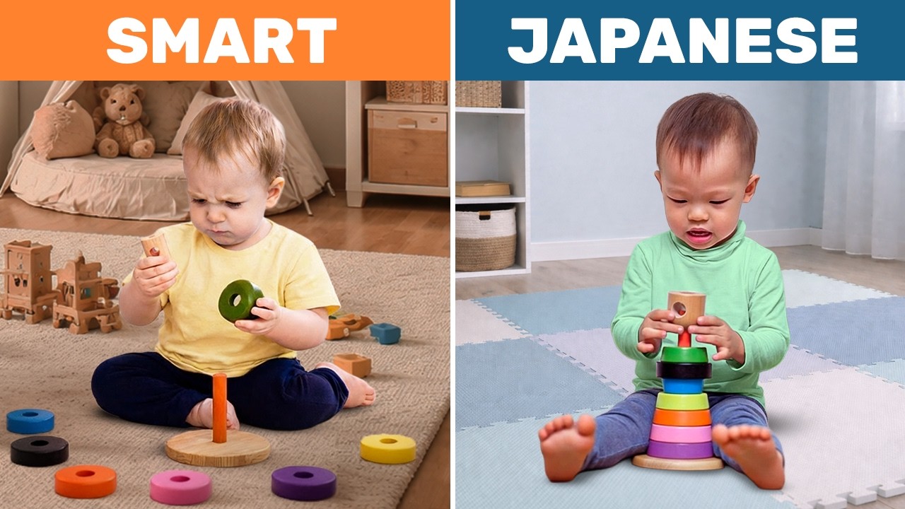
The split-screen comparison structure instantly communicates contrast and creates curiosity.
The use of the word JAPANESE leverages cultural-performance associations common in educational content.
The simple bold typography and clean framing maximize readability on mobile.
The toy interaction visually reinforces the developmental learning angle.
The thumbnail is optimized for quick cognitive scanning and emotional curiosity rather than detailed information.
Category:Thumbnails
Color Palette
orange
deep blue
beige
pastel multicolor
Brightness: bright soft daylight
Contrast: medium high
Colors: 4
Visual Siblings
Screens that share similar strategies