The price of not choosing yourself

Visual Siblings
Screens that share similar strategies
Attention Analysis
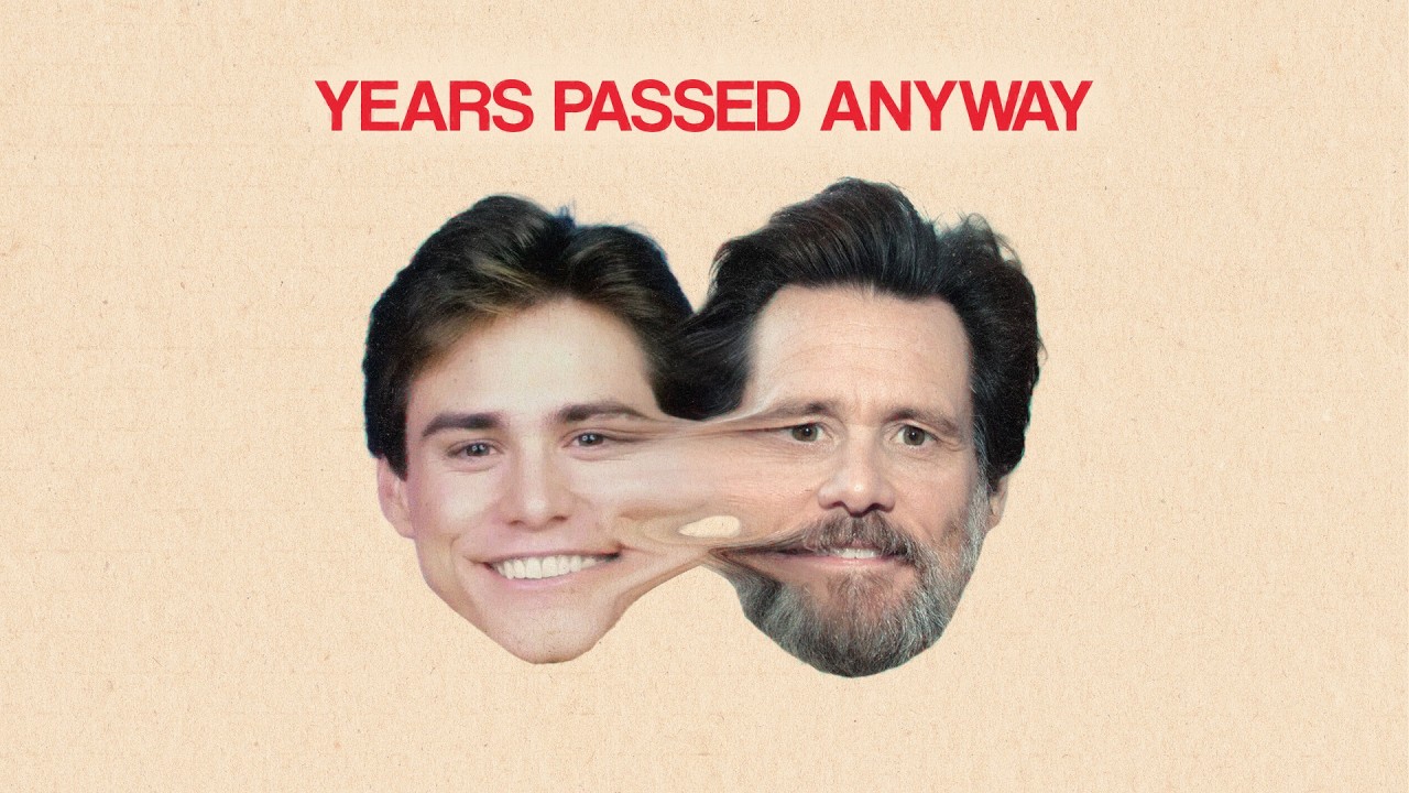
The warped morph between the younger and older faces visually communicates time slipping away.
The minimal beige background keeps full attention on the emotional transformation.
The bold red headline creates urgency and reinforces the emotional message.
The composition feels like a modern philosophical poster mixed with viral self-help aesthetics.
The use of recognizable celebrity aging increases emotional relatability and instant comprehension.
Category:Thumbnails
Color Palette
cream
beige
red
skin tones
Brightness: medium high
Contrast: soft medium
Colors: 4
Visual Siblings
Screens that share similar strategies