6 Beauty Habits I Wish I Started Sooner That Changed My Face

Visual Siblings
Screens that share similar strategies
Attention Analysis
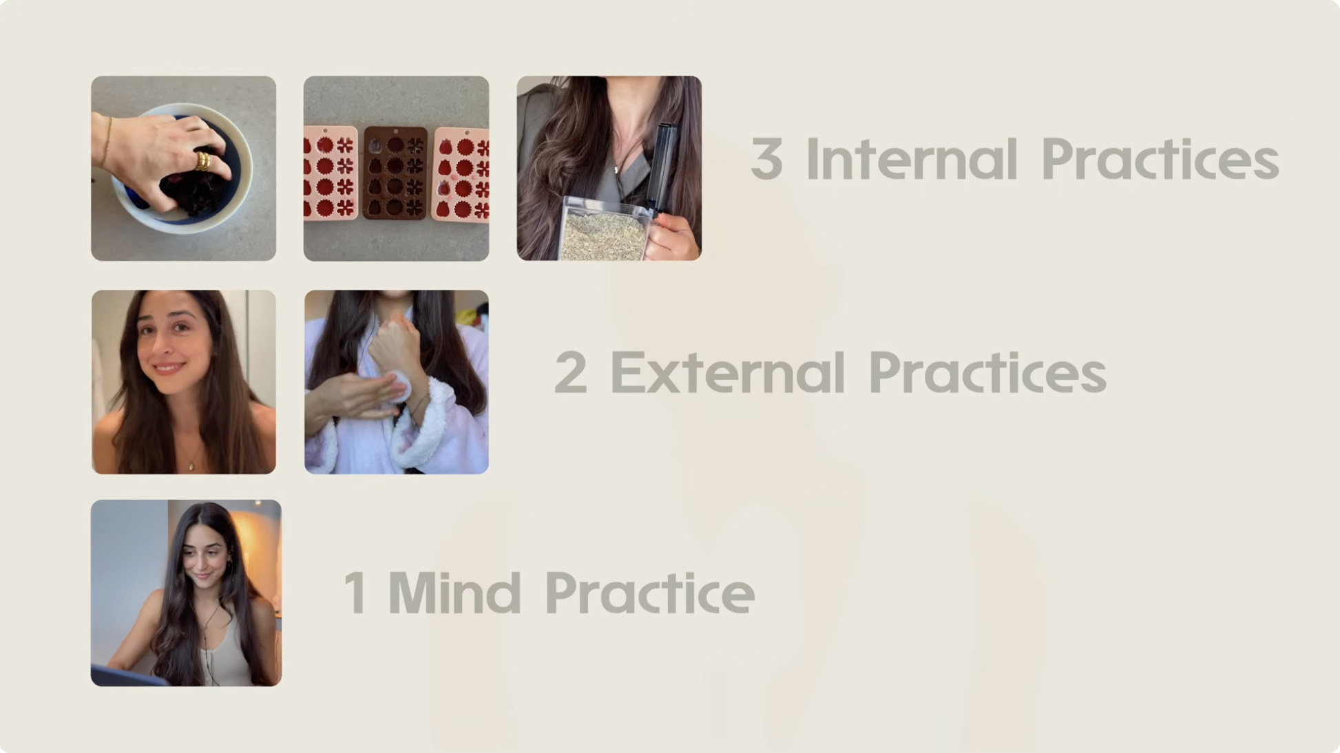
The slide uses a framework-based layout common in wellness and productivity creators to simplify complex routines.
Large soft typography paired with high negative space creates a premium calm aesthetic associated with luxury wellness brands.
The staggered visual tile arrangement creates a visual hierarchy without overwhelming the viewer.
Muted low-contrast text treatment reduces aggression and reinforces a soothing educational tone.
This format works especially well as a mid-video recap or summary slide in selfcare and wellness content.
Category:Graphics Slides
Color Palette
warm beige
cream
soft taupe
Brightness: bright soft lighting
Contrast: low contrast
Colors: 3
Visual Siblings
Screens that share similar strategies