5 Odd Beauty Habits That Changed My Face Completely

Visual Siblings
Screens that share similar strategies
Attention Analysis
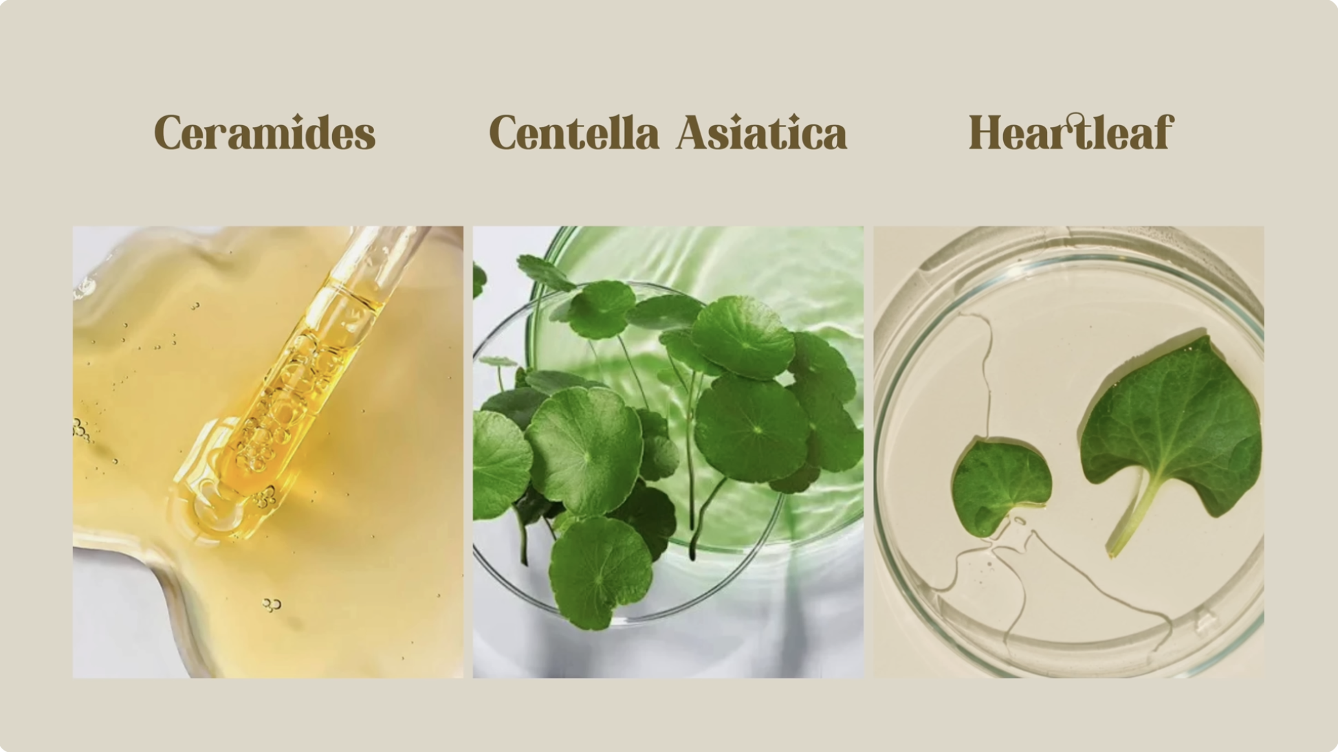
The visual language combines scientific credibility with natural organic beauty aesthetics.
Large editorial serif typography gives the graphic a premium skincare magazine feel.
The muted beige background and soft green/yellow ingredient tones reinforce calm luxury and clean beauty trends.
The structured three-column layout makes the content highly scannable for skincare education.
The imagery aligns closely with modern K-beauty and skin-barrier-focused educational content.
Category:Graphics Slides
Color Palette
warm beige
soft green
golden yellow
cream
Brightness: bright soft light
Contrast: low contrast
Colors: 4
Visual Siblings
Screens that share similar strategies