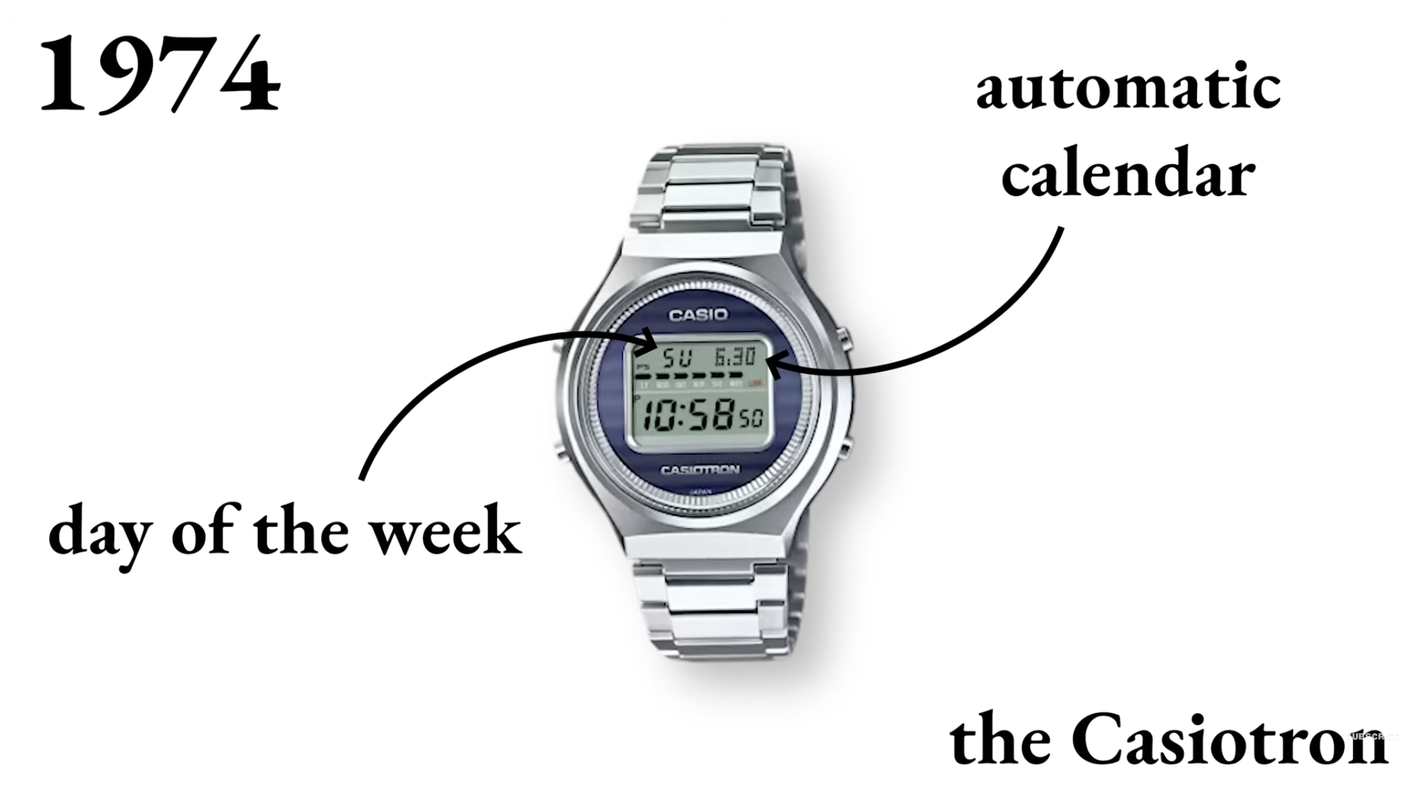
Casio: The Watch Designed to Last Forever

Visual Siblings
Screens that share similar strategies
Attention Analysis
The annotation arrows transform the image from a product showcase into an educational explainer.
The large serif typography reinforces a museum or archival-document aesthetic.
The sparse composition creates focus on the watch as a technological milestone.
The callout structure mirrors scientific diagrams and industrial design presentations.
The visual style blends editorial minimalism with educational infographic design.
Category:Graphics Slides
Color Palette
white
silver
blue
black
Brightness: bright
Contrast: medium
Colors: 4
Visual Siblings
Screens that share similar strategies