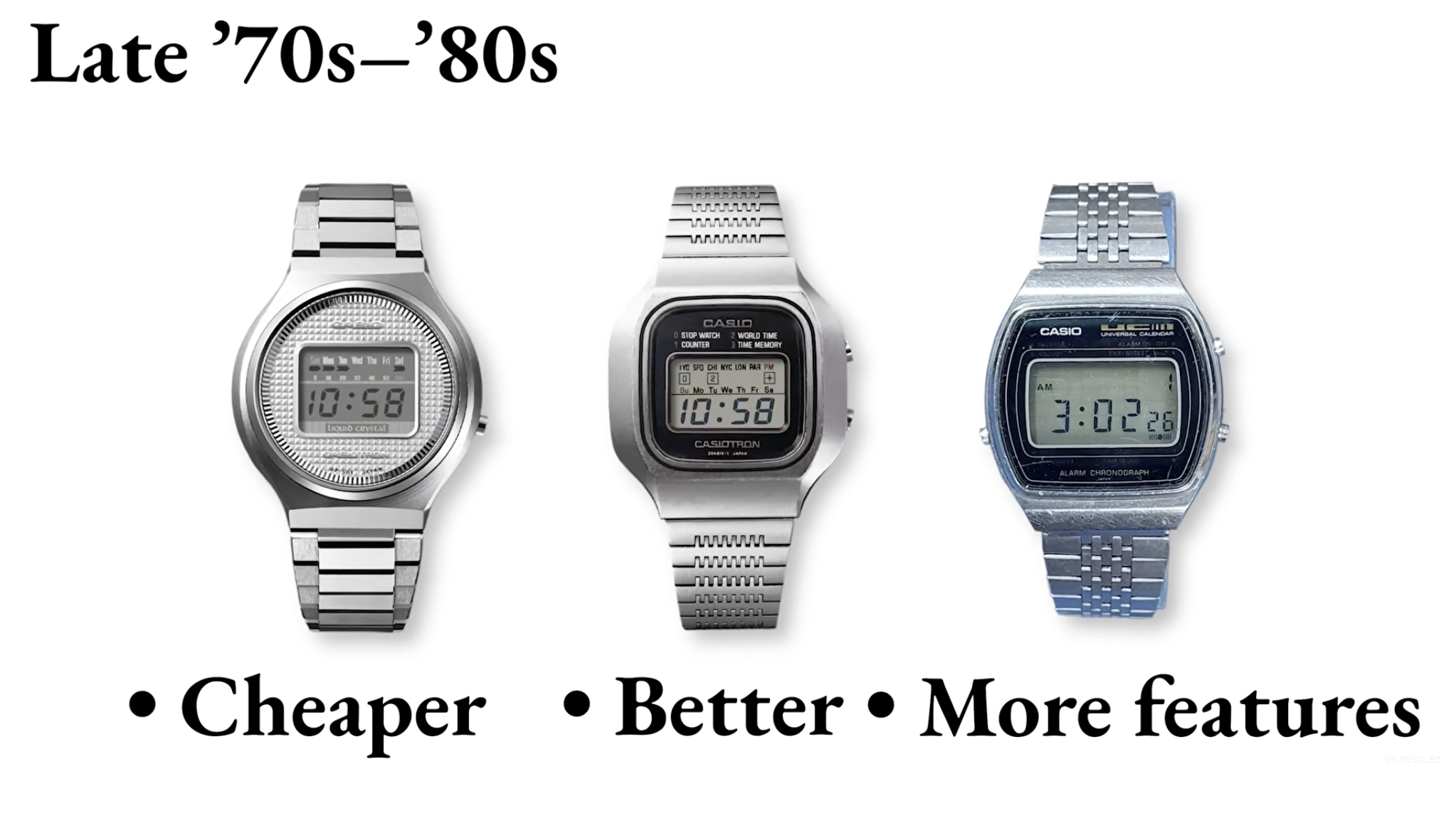
Casio: The Watch Designed to Last Forever

Visual Siblings
Screens that share similar strategies
Attention Analysis
The composition resembles a museum exhibit or educational slide explaining product evolution.
Large serif typography creates an archival and timeless feeling.
The bullet point structure simplifies the narrative into memorable consumer benefits.
The evenly spaced watches communicate progression and iteration over time.
The clean white background emphasizes the industrial design silhouettes of the watches.
Category:Graphics Slides
Color Palette
white
silver
black
blue gray
Brightness: bright
Contrast: medium
Colors: 4
Visual Siblings
Screens that share similar strategies