why do some things just look so good?
Visual Siblings
Screens that share similar strategies
Attention Analysis
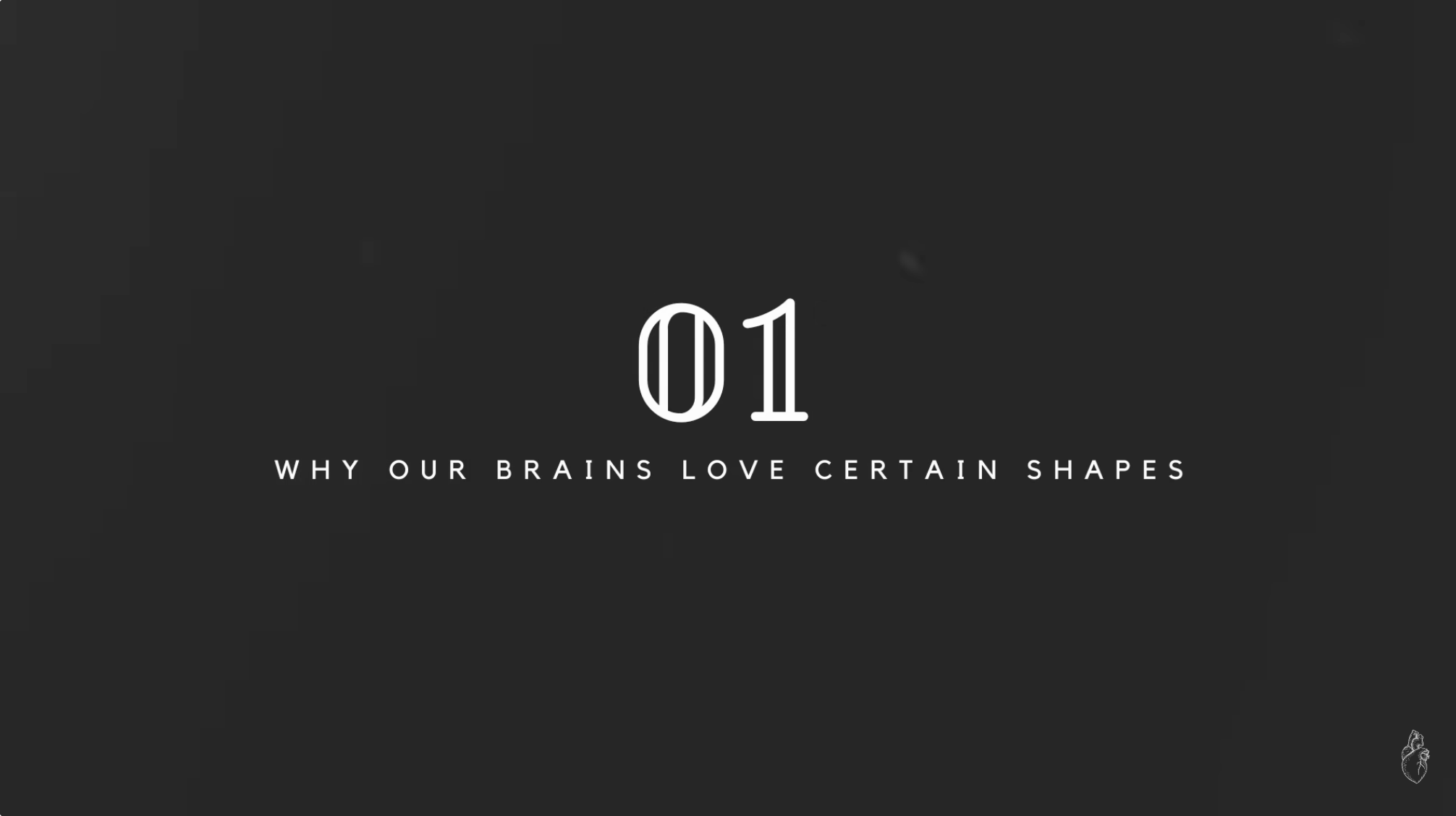
Acts as a chapter divider rather than a clickable thumbnail.
High negative space creates a premium, cinematic feel.
Typography hierarchy clearly signals structure.
Best used in-sequence, not as a standalone hook.
Category:Graphics Slides
Color Palette
black
charcoal gray
Brightness: low
Contrast: high
Colors: 2
Visual Siblings
Screens that share similar strategies