The 3-Stage Trick Behind Every Addictive App

Visual Siblings
Screens that share similar strategies
Attention Analysis
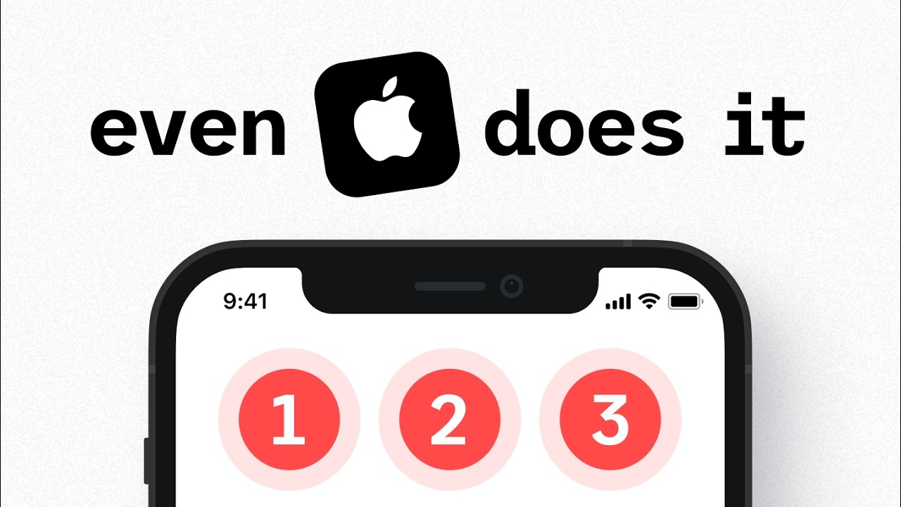
Replacing the word with the Apple logo creates instant brand recognition and visual interruption.
Minimal composition and oversized typography make the thumbnail highly scannable on mobile.
The numbered red circles imply a UX or notification system analysis without overexplaining.
Clean monochrome styling with selective red accents mirrors modern tech YouTube aesthetics.
Category:Thumbnails
Color Palette
light gray
black
soft red
white
Brightness: bright flat
Contrast: medium high
Colors: 4
Visual Siblings
Screens that share similar strategies