How To Be A B*tch — Why Being Nice Is Sabotaging Your Entire Life

Visual Siblings
Screens that share similar strategies
Attention Analysis
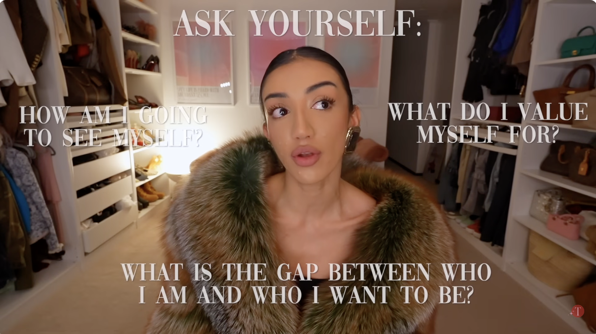
The typography placement surrounding the creator visually mimics internal thoughts or journal prompts.
The luxury environment softens the seriousness of the introspective messaging and keeps the frame aspirational.
Soft serif typography gives the frame a fashion-magazine editorial feel.
Off-camera eye direction reinforces contemplation and emotional authenticity.
Category:Screen Overlays
Color Palette
cream
brown
pink
black
Brightness: warm medium
Contrast: soft medium
Colors: 4
Visual Siblings
Screens that share similar strategies