How One of NYC’s Fastest-Growing Startups Scaled to $5 Billion

Visual Siblings
Screens that share similar strategies
Attention Analysis
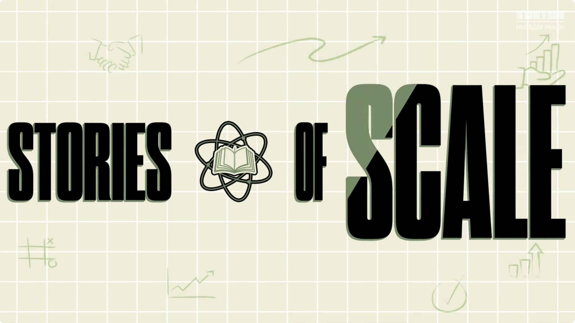
The oversized typography establishes authority and creates a recognizable editorial identity for the series.
The subtle business doodles and growth symbols reinforce the topic without cluttering the composition.
The split-color treatment on the word SCALE adds visual hierarchy and modernity.
The grid background gives the frame a strategic and systems-oriented feel associated with startup analysis.
The overall aesthetic resembles modern startup media branding and motion-design title cards.
Category:Channel Branding
Color Palette
beige
black
sage green
Brightness: soft muted
Contrast: high contrast text
Colors: 3
Visual Siblings
Screens that share similar strategies