the psychology behind why some homes feel good but most don't

Visual Siblings
Screens that share similar strategies
Attention Analysis
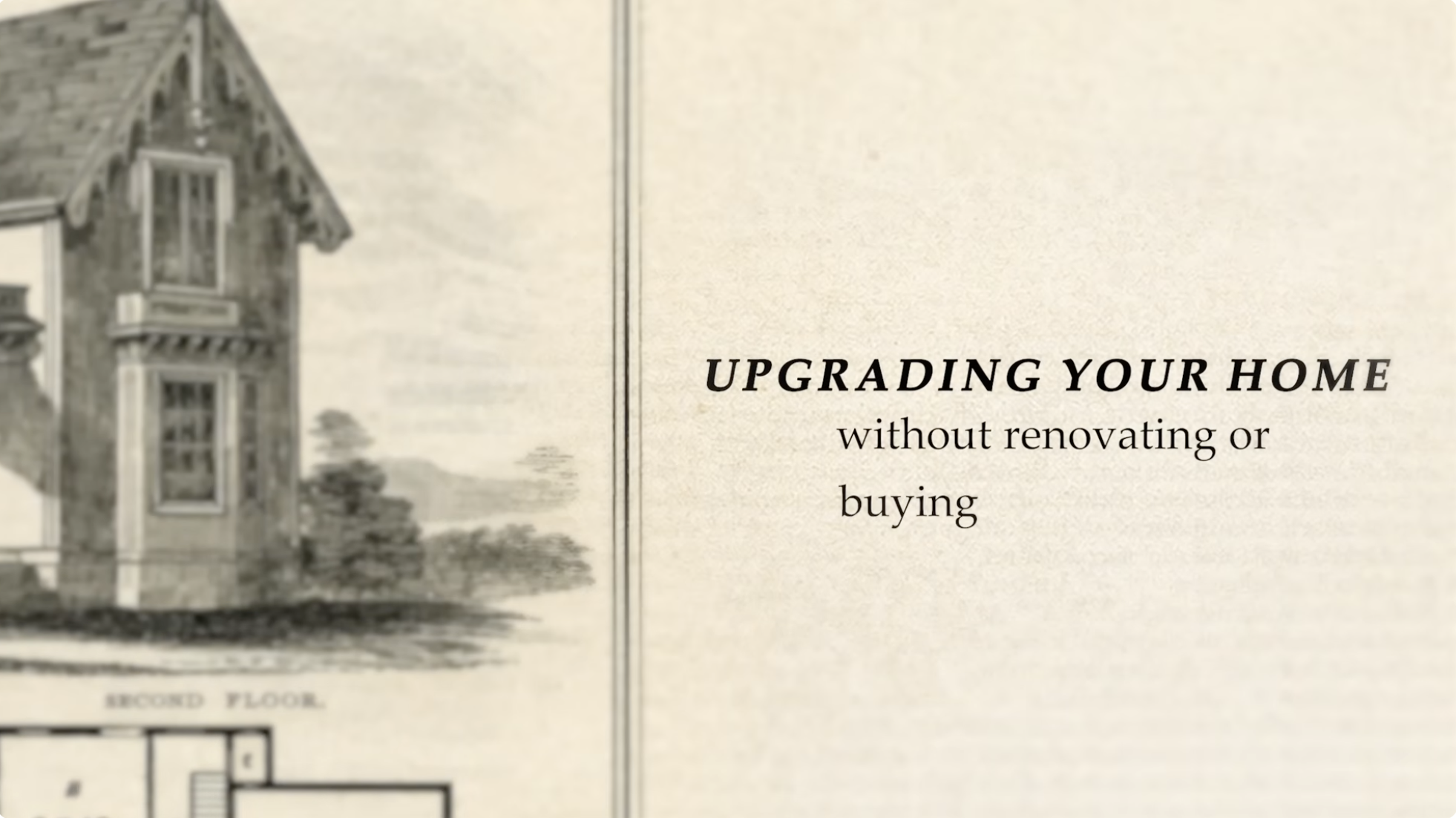
The serif typography and vintage architectural illustration create a premium editorial aesthetic.
Large negative space and restrained composition communicate calm sophistication.
The phrase 'without renovating or buying' introduces a practical curiosity hook tied to transformation without expense.
Muted cream and sepia tones reinforce a timeless, design-focused mood.
This frame feels more like a design magazine spread than a typical YouTube thumbnail, targeting aesthetically sensitive audiences.
Category:Graphics Slides
Color Palette
cream
sepia
black
Brightness: light
Contrast: medium
Colors: 3
Visual Siblings
Screens that share similar strategies