the psychology behind why some homes feel good but most don't

Visual Siblings
Screens that share similar strategies
Attention Analysis
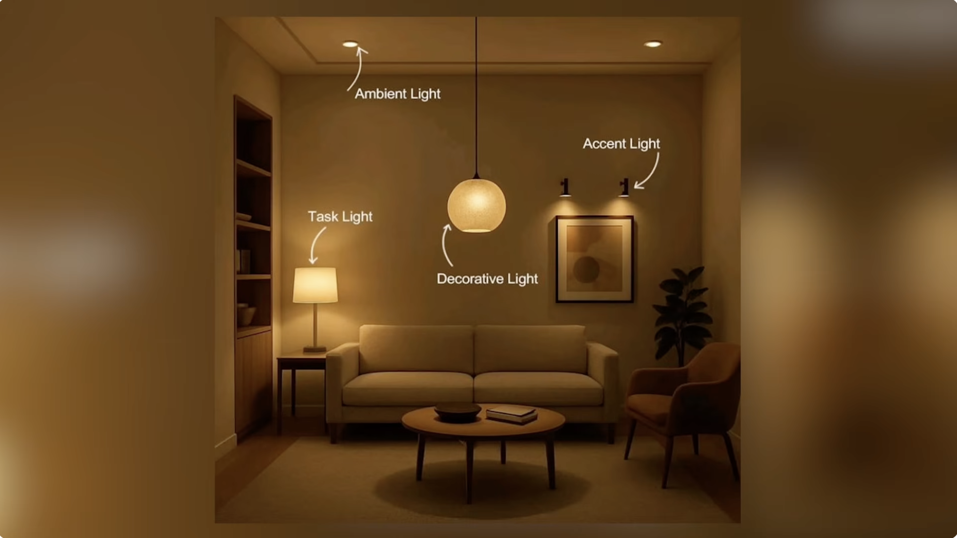
The image teaches layered lighting concepts through direct visual labeling.
Warm amber tones reinforce the emotional effect of cozy lighting design.
Curved annotation arrows guide the eye naturally through the lighting hierarchy.
The blurred vignette border creates focus on the central room composition.
This style is common in educational interior design reels and YouTube explainers.
Category:Screen Overlays
Color Palette
warm brown
amber
cream
soft black
Brightness: low medium
Contrast: soft cinematic
Colors: 4
Visual Siblings
Screens that share similar strategies