How I Tricked Myself Into Believing I Could

Attention Analysis
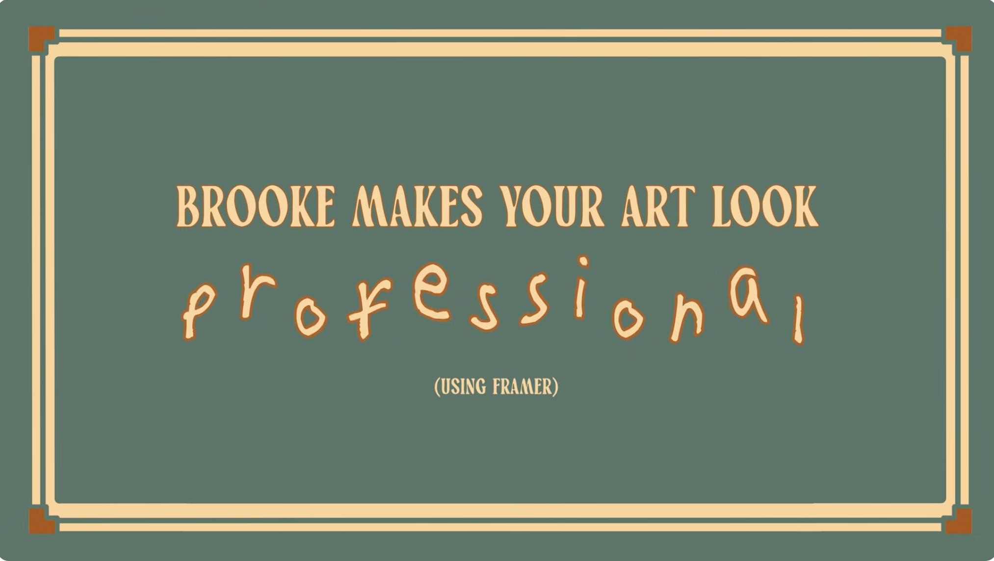
The vintage frame and serif type evoke a crafted, analog design vibe that reinforces the theme of making art look elevated.
Contrasting handwritten text for the word professional creates playful disruption, acting as a visual hook.
Minimal layout with strong negative space ensures the title remains the sole point of attention.
Muted green and cream palette gives the thumbnail a distinctive identity compared to typical high-saturation designs.
Category:Graphics Slides
Color Palette
muted green
cream
brown
Brightness: medium
Contrast: medium low
Colors: 3