how I edit my youtube videos in 2026 (color grade, graphics, & more)

Visual Siblings
Screens that share similar strategies
Attention Analysis
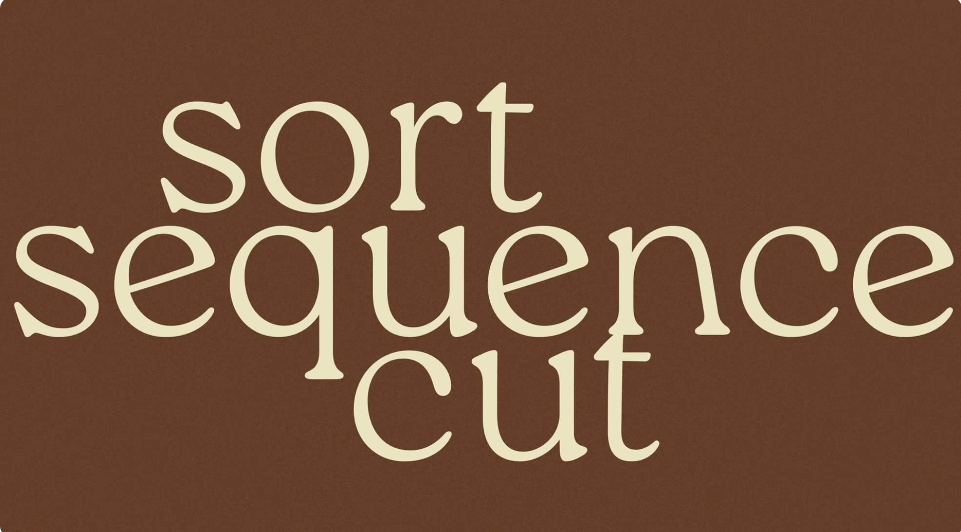
The composition relies entirely on typography and color palette for emotional tone.
Large serif typography with overlapping scale creates an editorial magazine aesthetic.
Warm brown background and cream text evoke retro print and book-cover design influences.
Strong resemblance to cinematic chapter cards and indie creator title slides.
Minimalism and typography hierarchy act as the core visual hook.
Category:Graphics Slides
Color Palette
brown
cream
Brightness: mid dark
Contrast: soft medium
Colors: 2
Visual Siblings
Screens that share similar strategies