you’re not dumb, you’re overstimulated - here’s how to decompress (beat brainrot! start journaling!)
Visual Siblings
Screens that share similar strategies
Attention Analysis
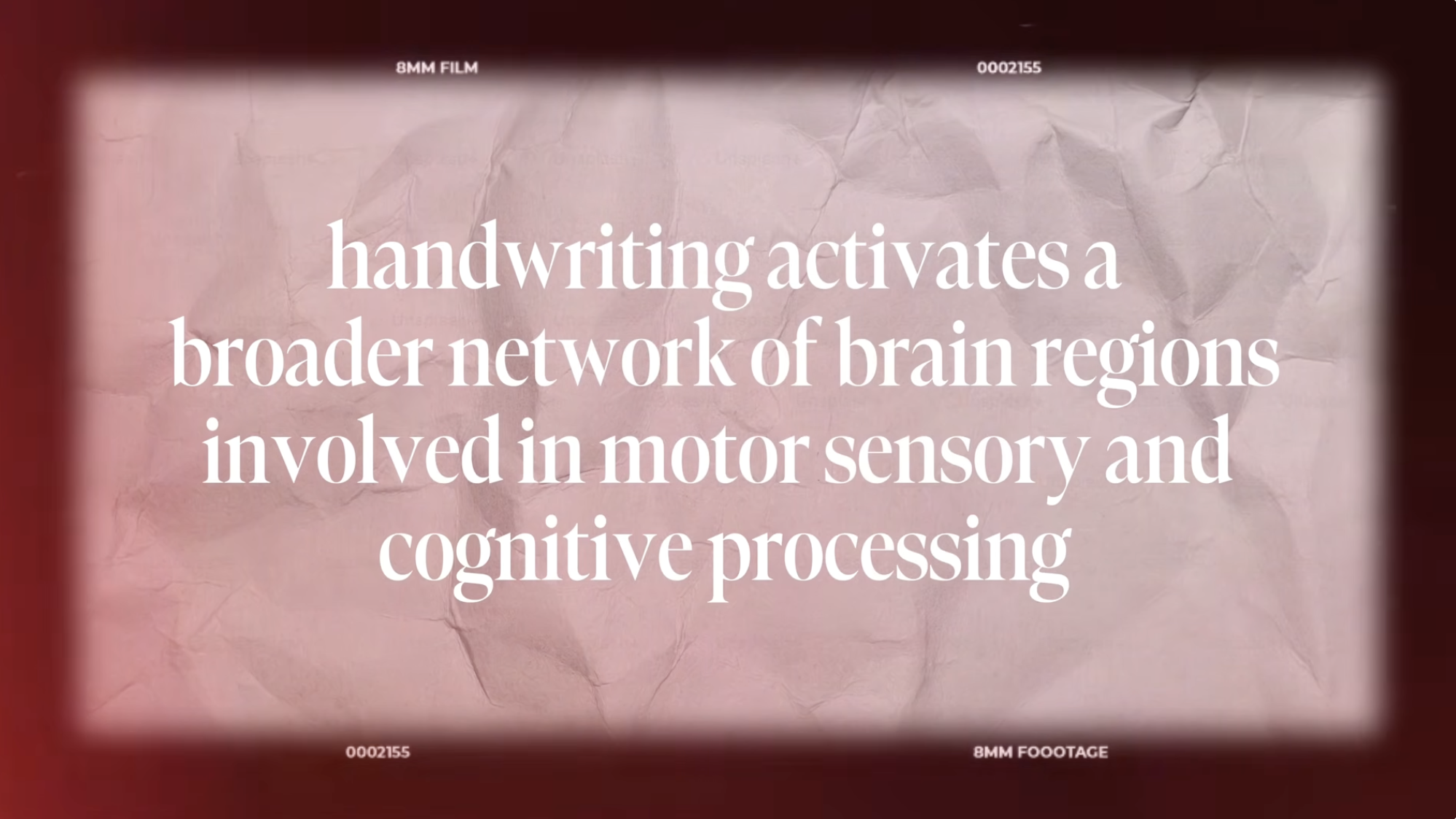
The oversized serif typography creates an editorial magazine feel associated with thoughtful educational content.
Film burn edges and 8mm overlays evoke nostalgia and analog authenticity.
The crumpled paper texture subtly reinforces the tactile theme of handwriting.
Soft pink and red gradients make the scientific statement feel emotionally warm rather than clinical.
The composition relies almost entirely on typography hierarchy and texture rather than imagery.
Category:Graphics Slides
Color Palette
dusty pink
deep red
cream
soft white
Brightness: medium soft
Contrast: low contrast editorial
Colors: 4
Visual Siblings
Screens that share similar strategies