Making an iPhone Standby Mode Dock ft. OVERWERK

Visual Siblings
Screens that share similar strategies
Attention Analysis
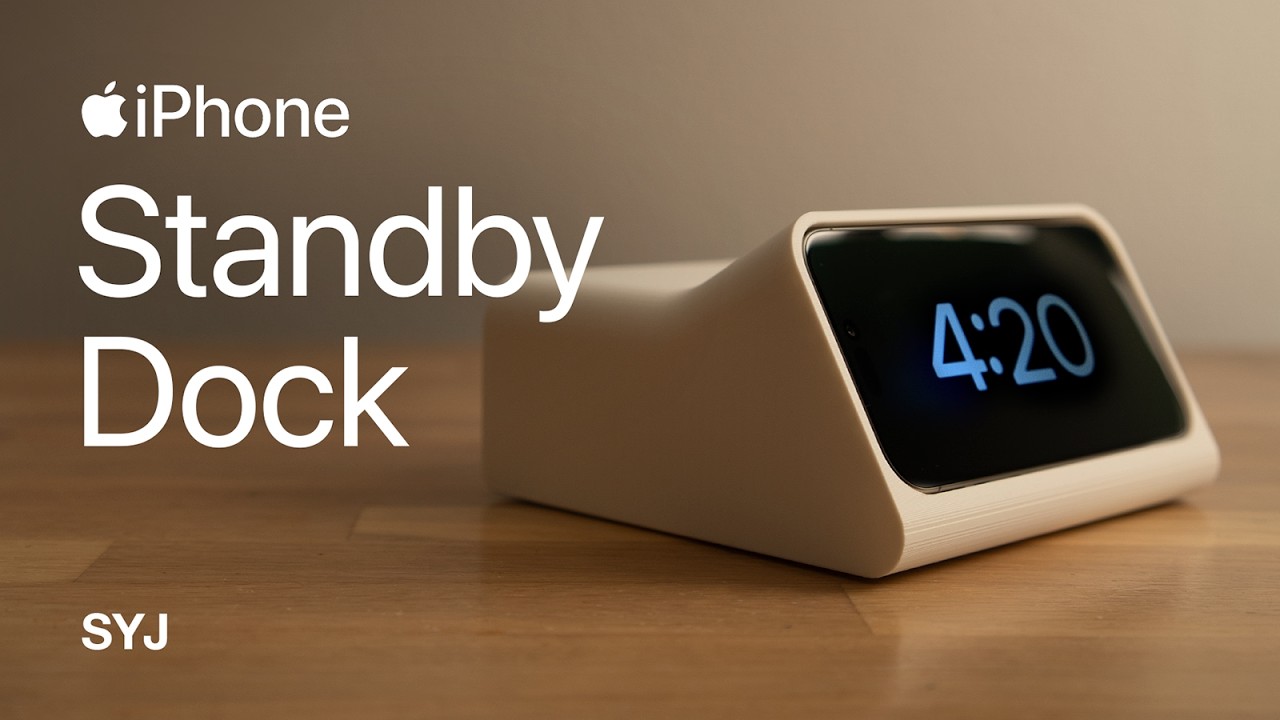
The left-aligned large text immediately communicates the product and Apple tie-in, creating instant recognition.
Minimalistic composition mirrors Apple's own marketing style, which subconsciously signals quality.
The strong contrast between bright white text and warm background makes the headline readable even at small sizes.
The glowing 4:20 clock screen adds a focal point and subtle motion implication, drawing the eye to the dock.
Category:Thumbnails
Color Palette
warm brown
soft beige
Brightness: medium low
Contrast: medium
Colors: 2
Visual Siblings
Screens that share similar strategies