The World Feels Wrong Because You're Paying Attention
Visual Siblings
Screens that share similar strategies
Attention Analysis
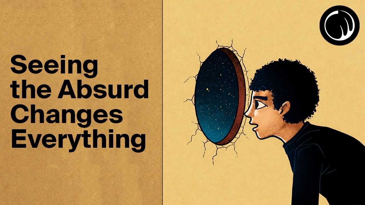
The split composition creates a strong editorial balance between concept and illustration.
The cosmic portal metaphor visually represents perspective shifts and existential awareness.
Warm paper textures combined with minimalist illustration evoke modern philosophy channels.
Large stacked typography makes the abstract topic feel accessible and visually bold.
The minimal logo treatment reinforces a refined visual identity without distraction.
Category:Thumbnails
Color Palette
warm beige
tan
dark blue
black
Brightness: medium
Contrast: medium high
Colors: 4
Visual Siblings
Screens that share similar strategies