Using Apple Vision Pro: What It’s Actually Like!

Visual Siblings
Screens that share similar strategies
Attention Analysis
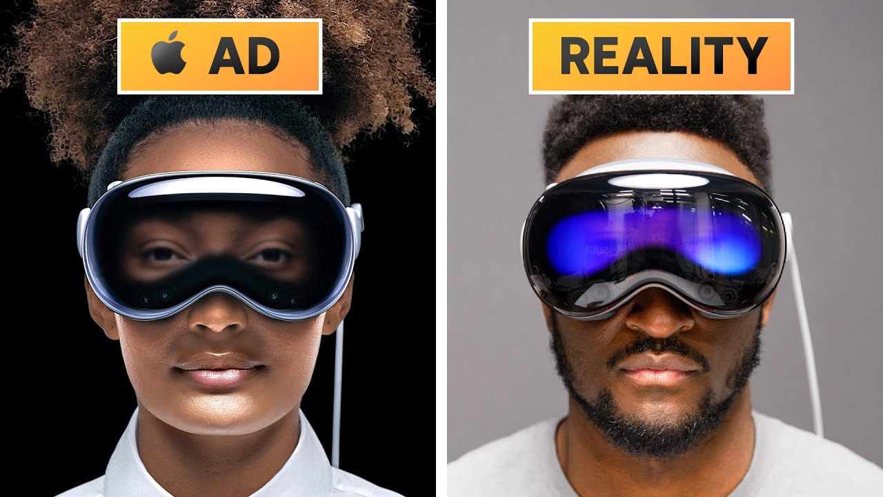
Strong contrast between polished ad look and realistic use creates instant curiosity.
Bright gradient labels make the comparison unmissable.
Reflections and lighting differences heighten the expectation-vs-reality tension.
Category:Thumbnails
Color Palette
black
gray
white
blue reflections
Brightness: dark left
Contrast: high
Colors: 4
Visual Siblings
Screens that share similar strategies